Josh Starmer_StatQuest (YouTube)
This channel is basically a treasure trove of teaching in the statistics field. Josh Starmer's teaching style is incredibly relaxed and humorous; he can explain very complex statistical concepts as simply as elementary school math.
His content covers a wide range, from basic descriptive statistics, probability distributions, and hypothesis testing, to more advanced topics such as machine learning algorithms, linear regression, logistic regression, random forest, and PCA (principal component analysis).
Why it's important:
Many people get stuck on "conceptual understanding" when learning statistics, especially abstract concepts like p-value, confidence interval, and Bayes' rule. Josh's courses use visual diagrams and musical memorization techniques; he even sings to explain algorithms, helping you truly understand rather than just memorize.
How to use it:
You can find playlists according to your learning stage:
- If you're a beginner, start with the "StatQuest Basics" series;
- If you're taking a data analysis course in Python or R, you can skip directly to the "Regression and ML" series;
- If you're preparing for research or dataset analysis, his "StatQuest on ANOVA / Chi-Square / t-tests" series can help you understand when to use each test.
What we can find here can help:
- a. Build a strong foundation in statistics and data interpretation
- b. Understand machine learning models conceptually (no heavy math)
- c. Improve your ability to explain data methods clearly in your own words (great for presentations or interviews)
Access Link: https://www.youtube.com/c/joshstarmer
Storytelling with Data – Chart Guide
This is one of the most practical websites in the field of data visualization, founded by Cole Nussbaumer Knaflic. Her philosophy is: "It's not about showing data, it's about telling a story".
Website Content:
This "Chart Guide" section is actually a chart style guide. It tells you:
- When to use bar charts, line charts, and scatterplots;
- Which chart types are misleading;
- How to choose appropriate color palettes, labels, and legend placement;
- How to use visual hierarchy to help readers quickly understand the key points.
Why it's important:
In journalism and marketing communication, data storytelling is one of the core skills. Often, we don't lack data, but rather we don't know how to "let the data speak". This guide will upgrade you from "creating charts" to "telling stories".
How to use it:
When you are preparing a report or research presentation, or want to design a chart that clearly conveys information, you can open this website: See the "When to use / When not to use" for each chart; Compare its examples with your own charts to see where you can make them more concise or persuasive.
What we can find here can help:
- a. Choose the right chart for the right data type
- b. Learn visual storytelling principles (clarity, focus, emotion)
- c. Improve data communication in reports, slides, and dashboards
Access Link: https://www.storytellingwithdata.com/chart-guide
Python Graph Gallery
This website is a code gallery for data visualization. Its goal is to help you quickly find the graphs you want to draw and provide a directly copyable, runnable Python code.
Overview:
The content is based on commonly used Python visualization libraries:
- Matplotlib
- Seaborn
- Plotly
- Folium
- Altair
Each chart type (e.g., heatmap, bubble chart, network diagram, density plot) is clearly categorized and comes with actual data and output images.
Why it's important:
For students of data journalism, marketing analytics, and even finance reporting, this website is like a toolbox for visual expression. It takes you directly from theory to practice. You don't need to memorize syntax; simply find a similar chart, copy the code, and adjust the variables to create your own visualization.
How to use:
- Click "Gallery" in the top navigation bar and select the chart type;
- Copy the code and paste it into your Jupyter Notebook;
- Replace it with your own dataframe or CSV file;
- Modify details such as colors and titles.
What we can find here can help:
- a. Master Python data visualization coding with ready-made templates
- b. Learn the visual style differences among Matplotlib / Seaborn / Plotly
- c. Speed up your data storytelling projects with professional charts
Access Link: https://python-graph-gallery.com
FreeCodeCamp – Python for Everybody
This is one of the best free Python courses for beginners, offered by FreeCodeCamp and based on a course designed by Professor Charles Severance, also known as Dr. Chuck, at the University of Michigan.
Course Content:
Starts with the most basic Python syntax, including:
- variables
- loops & conditionals
- functions
- data structures like lists, dictionaries, tuples
- file handling & regular expressions
- accessing web data & using APIs
Why it's important:
Many communication or journalism students find Python "too difficult," but this course is completely beginner-friendly with real-life examples. For example, it uses "reading email data" and "analyzing text" to explain for loops, making it perfect for people without a computer science background.
How to use:
Starting from the first module, each section includes videos and exercises. You can write code directly online without installing any IDE. It's recommended to practice data cleaning with a small dataset, such as a CSV, after each chapter.
What we can find here can help:
- a. Build solid foundation in Python programming
- b. Learn practical coding for data cleaning, analysis, and automation
- c. Prepare for data journalism, marketing analytics, or finance analytics coursework
Access Link: https://www.freecodecamp.org/learn/python-for-everybody/
DataJournalism
DataJournalism is an international learning and resource platform focused on data journalism and data storytelling, supported and operated by the European Journalism Centre. It provides journalists, communicators, researchers, and students interested in data with a wealth of learning resources, tools, and case studies to help users improve their ability to tell stories using data.
Overview:
The website primarily includes several learning sections, including:
- Courses: Providing systematic, free courses covering data acquisition, cleaning, analysis, and visualization;
- Longreads: Exploring cutting-edge trends and practical methods in data journalism;
- Tools & Resources: Recommending practical visualization, statistical, and analytical tools;
- Community: A platform for sharing experiences and projects from data journalists and scholars worldwide.
Why it's Important:
DataJournalism.com is not just a teaching website, but a "learning ecosystem" for data storytelling practices. It combines journalistic thinking, data analysis, and visual expression, enabling users to understand the social significance behind data and transform complex information into stories easily understood by the public. For students studying journalism, communication, marketing analytics, or sustainability communication, this is a vital resource for enhancing data literacy and storytelling skills.
How to use it:
Start with Courses to systematically learn the data journalism workflow; Read Longreads to understand the latest industry trends and thinking; Go to Tools & Resources to find tools that can be directly applied to classes or projects; Follow community-shared case studies to learn how journalists from different countries use data to tell stories.
What we can find here can help:
- a. Build a solid foundation in data journalism and storytelling techniques
- b. Learn how to analyze, visualize, and communicate data-driven insights
- c. Connect global perspectives and apply data thinking to real-world issues
Access Link: DataJournalism.com
R for Journalists
By Paul Bradshaw
Overview
- Introduction to R for Journalists
- R Environment and Basic Operations
- Data Cleaning
- How to Clean News Data with R
- Data Analysis
- Statistical Description, Grouping, Aggregation
- Data Visualization
- Creating Charts with ggplot2, maps, etc.
- Story Ideas from Data
- How to Discover News Clues from Data
Why It's Important
Compared to pure data science courses, this website emphasizes the application of R in a news context.
It teaches you how to:
- Transform raw data into newsworthy insights
- Track trends and perform fact-checking using code
- Generate publication-ready visualizations
What we can find here can help:
- a. Learn R programming specifically tailored for journalism workflows
- b. Practice data cleaning, analysis, and visualization in real newsroom contexts
- c. Build confidence to integrate quantitative storytelling into reporting
Access Link: https://rforjournalists.com/
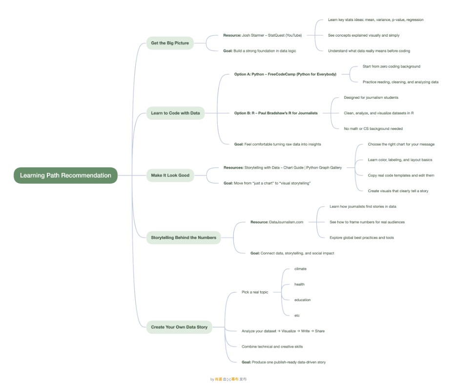
Learning path mind map
The following is an overview of all recommended resources and goals:
Published by Yao Xiao