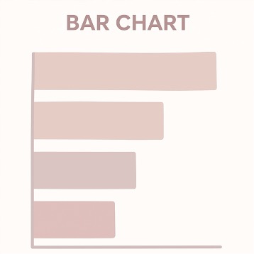
Use Charts to Answer Questions, Not Decorate Slides

Return to HomePage
Show change → Line chart (trend over time)
Show comparison → Bar chart (who’s higher/lower)
Show relationship → Scatter plot (correlation between two things)
Show composition → Avoid pie charts when possible, use stacked bars, waterfall, or treemaps instead
Show order → Always sort logically (by value or time)

Common Chart Types (and When to Use Them)

Bar Chart Example

(Image 1: Bar Chart Example)

(1) Bar Chart

Use it for: Comparing categories → media platforms, city audiences, ad versions. Tips:

Examples:

Bar Chart Example

(Image 2: Line Chart Example)

(2) Line Chart

Use it for: Anything that changes over time (daily, weekly, monthly). Tips:

Examples:

Bar Chart Example

(Image 3: Scatter Plot Example)

(3) Scatter Plot

Use it for: Showing relationships

Exposure vs. Conversion
Length vs. Engagement.

Tips:

Examples:

Bar Chart Example

(Image 4: Stacked Bar Chart Example)

(4) Stacked Bar Chart

Use it for: Showing composition (parts of a whole) over time or by category — for example, ad spend split across channels or topic mix across months. Tips:

Examples:

Bar Chart Example

(Image 5: Bubble Chart Example)

(5) Bubble Chart

Use it for: Showing the relationship between three variables — where x and y represent two numeric dimensions (e.g., ad spend vs. engagement), and the size of the bubble represents a third one (e.g., audience reach or revenue). Tips:

Examples:

Bar Chart Example

(Image 6: Pie Chart Example)

(6) Pie Chart

Use it for: Showing how a whole divides into parts — each slice represents a percentage or proportion of a total (like market share, traffic source, or budget breakdown). Tips:

Examples:

Bar Chart Example

(Image 7: Histogram Example)

(7) Histogram / Density Plot

Use it for: Showing the frequency distribution of one numeric variable — like reading time, watch duration, or post engagement. Tips:

Examples:

Bar Chart Example

(Image 8: Map Example)

(8) Map

Use it for: Only when geography actually matters — not just because maps look cool. Tips:

Examples:

Bar Chart Example

(Image 9: Small Multiples Example)

(9) Small Multiples

Use it for: Repeating the same type of chart with identical scales — ideal for clean, side-by-side comparisons. Tips:

Examples:

Bar Chart Example

(Image 10: Gauge/Speedometer Example)

(10) Gauges / Speedometers

Use it for: Dashboard metrics that show one value vs. a target (e.g., goal progress). Tips:

Examples:

Other Resources and Readability

Other Useful Charts that we can use Wisely

Color, Labels, Readability

Quick Match-Up by Field

Journalism / Data Journalism

Media / Social Analytics

Strategic Communication / PR

Marketing / Growth

Key Rules and Checks

Key Things to Remember to Avoid Misleading Your Audience

Pre-Publish Checklist

Quiz: Check Your Data Visualization Knowledge

1. If you're comparing the count of five categories and one is much smaller, which chart best prevents exaggeration of the small difference?

2. The best way to show a trend over time, such as daily website traffic for a month, is with a:

3. What should you always do when using a Bar Chart to compare categories?

4. Which of these is a correct use case for a Scatter Plot?

5. What is the main reason to avoid the “rainbow” color palette in data visualization?

6. A sponsor asks for a 3D pie chart “to make it more eye-catching.” Which is the most accurate response?

7. You’re comparing five ad campaigns by ROI. Alphabetical order is neutral, but descending order by ROI makes the winner clear. Which choice depends on your communication goal?

8. A data-heavy figure appears in your report with no annotation. Editors complain it “looks like a math problem.” What’s missing?

9. Two products show CTRs of 3.1% and 3.3%. Without confidence intervals, the reader concludes the second is better. What’s the real issue?

10. Your beautifully annotated bar chart becomes unreadable on phones. What’s the best fix without losing information?